Ayuthaya Spa
Aloha Spa
Ananda Spa
www.ayuthayaspa.com
1.1 About The Company
Ayuthaya Spa- The Royal Thai Spa, was the Finalist for the Hospitality Asia Platinum Awards 2006-2007 in Best Spa Category. Services provided included Massage, Body Wellness, Facial Treatment, Manicure and Pedicure. Other than that, they also introduce Spa Packages like Ayuthaya Total Zen, Thai Herbal Heat Revival, Thai Sanctuary, Thai Herbal Harmony, Senses Reviver and Stress Recovery. Prices are in between $128-$188++.
1.2 Official Website Analysis
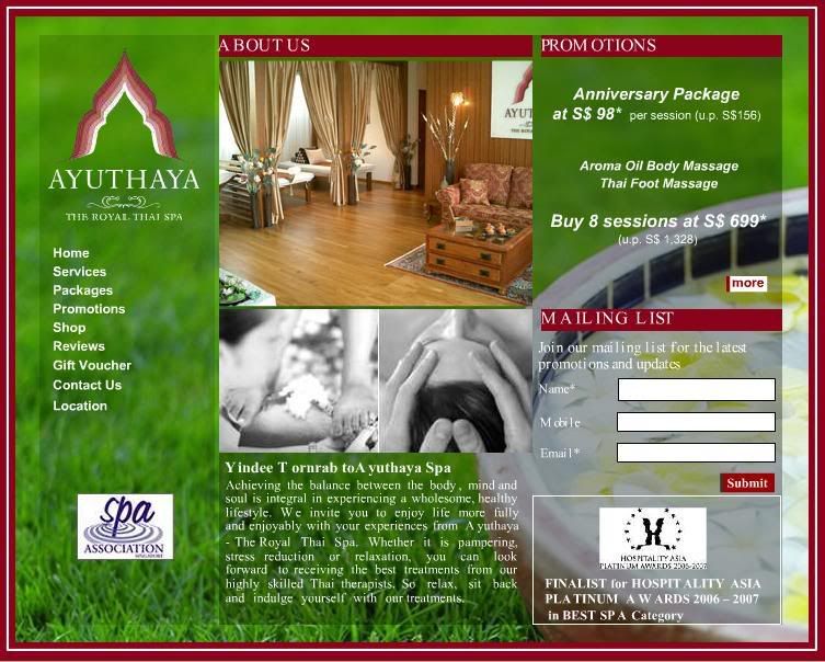
Layout Design:
i) Fixed background.
ii) Fixed frame.
iii) Fixed Grid. 1 row 2 column.
Theme Colour:
Red, White, Green.
Typeface & Fonts:
San-Serif, white.
Navigations: All on the left included:
i) Home
ii) Services
iii) Packages
iv) Promotions
v) Shop
vi) Reviews
vii) Gift Voucher
viii)Contact us
xi) Location.
Effect & Transition:
i) Fade in.
ii) Page Transition from top to bottom.
iii) Navigation hover effect- red highlight while rollover.
Contents Design:
All navigations are on the left and all contents are on the right. Boxy frames are used to divided the contents. All images are in square shape. All texts are done in flash. No real text.
Sound:
Background music looping and navigations rollover sound effect applied.
Building Method:
Flash Based.
Good points:
- Background music applied.
- Usage of flash.
- Good in fitting in all the contents.
Weaknesses:
- Colour mood and feel doesn’t suit the company. Not relax enough as a spa website.
- Too boxy.
- Fixed background, frames, grids and transition. Boring.
- Lack of interesting graphic.
- No highlight for selected navigation.
- Loading too slow.
- Too centralized. Wasting of space.
www.alohaspamaui.com
2.1 About the Service
Aloha Spa is an outcall spa service. They offer professional and therapeutic services by licensed and insured therapists. Their services included Hawaiian Lomi Lomi, Deep Tissue, Swedish, Sports, Jet-Lag, The Duet, and Aloha Super Saver.
2.2 Official Website Analysis
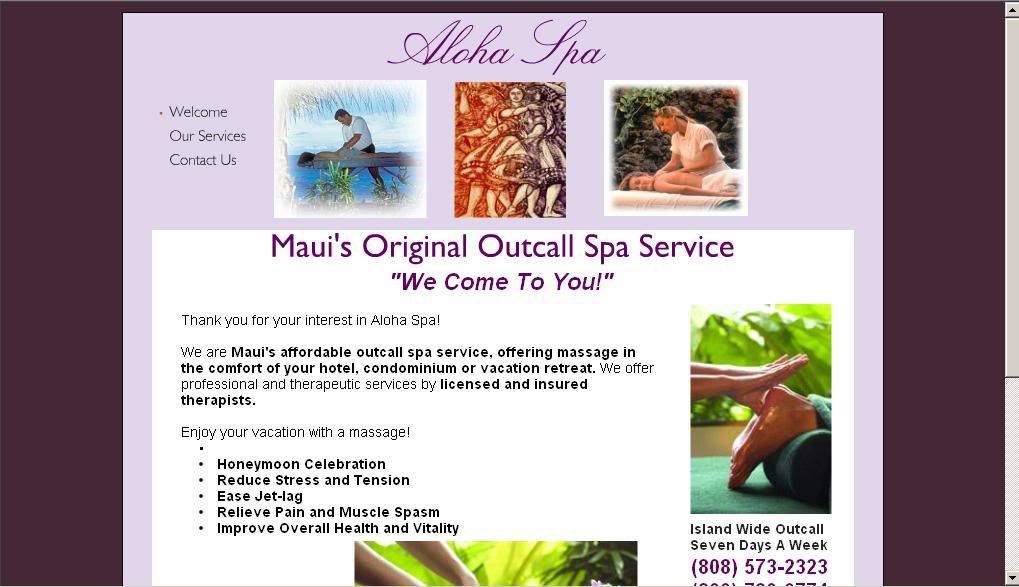
Layout Design:
i) Violet Background
ii) Fixed white frame.
iii) Fixed Grid. 2 rows 1 column.
Theme Colour:
Dark Purple, Violet, Black, White.
Typeface & Fonts:
San-Serif, black.
Navigations:
All on top left included:
i) Welcome
ii) Our Services
iii) Contact Us
Effect & Transition:
None
Contents Design:
It is a vertical site. All the navigations are on the top left and all contents are all fitted in a box at the bottom. The main title is on the top center and there are three small low-resolution picture beside the navigations. Other than that, not much of other images, Graphic, logo or banner included. Basically the girding and contents
are messy too.
Sound:
No sound effect.
Building Method:
Basic Html.
Good points:
- Direct enough.
- Fast loading.
Weaknesses:
- Bad colour mood.
- Too boxy.
- Too plan.
- Lack of interesting graphic.
- Lack of content.
- Bad typeface usage.
- Messy girding.
- Text layout is messy.
- Too simple. No other plug-in included.
- Boring.
- Not professional.
- Bad navigations design and placing.
www.anandaspa.com
3.1 About the Company
Ananda Spa is an award winning spa for year 2005-2007 The 21,000 square foot spa offers an extensive menu of over 79 body and beauty treatments, integrating the traditional Indian systems of Ayurveda with the more contemporary Western spa approach. The spa experience strives to achieve the ultimate harmony between the physical and the mental realms of the individual. Services provided included Yoga, Ayurveda, Spa Cuisine, Fitness and Spa Treatment.
3.2 Official Website Analysis
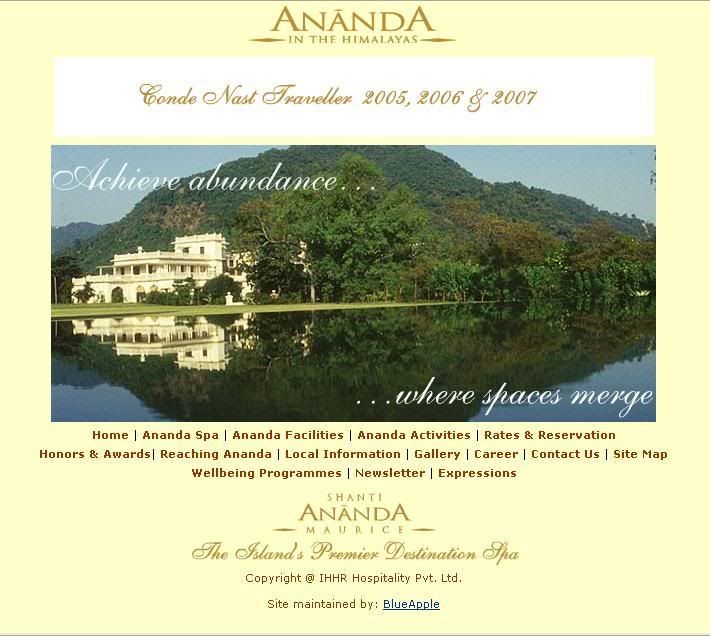
Layout Design:
i) Yellow background.
ii) Top and bottom navigations.
iii) Fixed grid. 4 rows 2 column.
Theme Colour:
Yellow, Scarlet, Black.
Typeface & Fonts:
San-Serif, black.
Navigations:
Top included:
i) Home.
ii) Ananda Spa .
iii) Ananda Facilities.
iv) Wellness Retreats.
v) Ananda Activities.
vi) Honors & Awards.
vii) Rates & Reservations.
Bottom included:
i) Reaching Ananda.
ii) Local Information.
iii) Gallery.
iv) Career.
v) Contact Us.
vi) Site Map.
vii) Newsletter.
xi) Expression.
Sub-navigations appear when rollover the main navigations.
Effect & Transition:
Sub-navigations drop down when navigations rollover.
Contents Design:
There is a flash banner at the most top of the site, follow by the first main navigation bar. All the main contents are placed in frame in the middle of the site. Lastly at the most bottom is the second main navigation bars. Besides that, sub-navigations are shown as a drop down menu when the main navigations being rollover. All images and texts are placed following the same grid system in every pages.
Sound:
No sound effect.
Building Method:
Html, Flash.
Good points:
- Consistent layout.
- Consistent colour.
- Full of contents. Detail.
- Neat contents arrangement.
- Good in putting in all the contents.
- Uses flash banner.
- Rollover drop down sub-navigations. Saved space and allow to put in more contents.
Weaknesses:
- A little too pack.
- Too boxy.
- Lack of interesting graphic. Too many texts.
- Boring.
- Colour mood not relax enough as a spa website.
No comments:
Post a Comment