- Slap Shot
- Motorola Z6M
- Musical Talk
- 30days of Night
- Ivy Club
- Trash Buster
http://slapshot.nexon.com/slapshot/Page/Gnx.aspx?URL=Home/Index
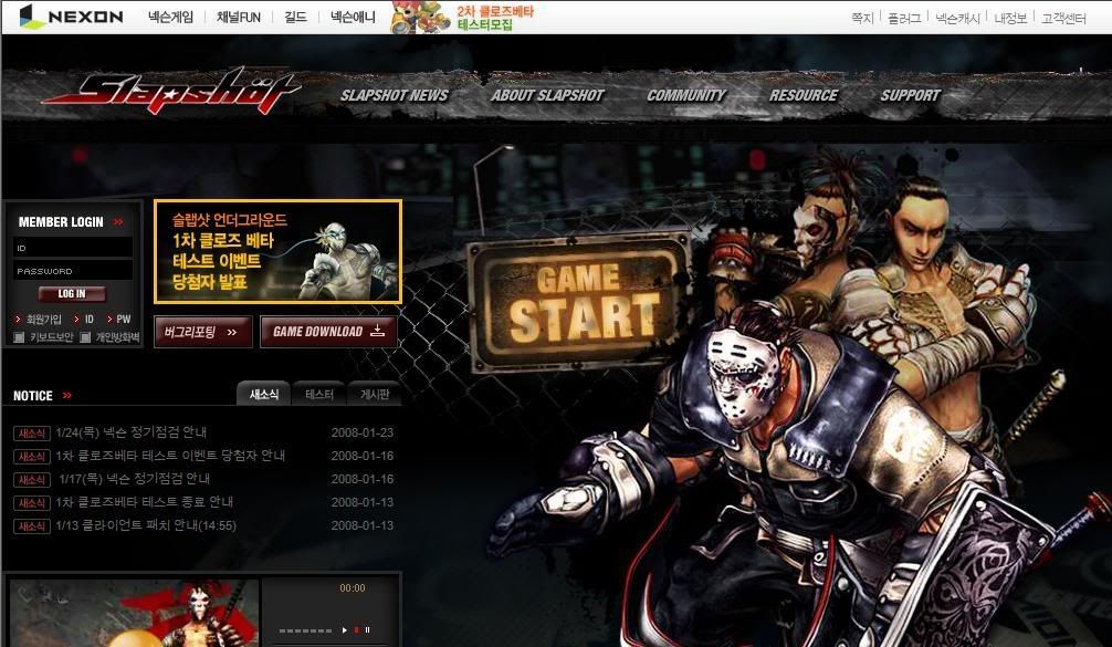
This is the official Website of the game Slap Shot. It contains a lot of high quality and nice graphics. Thus, it successfully brings out the mood and feeling of the site. In the term of content design, among most of the korean website that I visited, it can considered one of the most well-arranged and easy to navigate site. First, it has its logo placed formally on the top left and the main navigations bar beside it. Sub-navigations display while rolling over the main navigations and appear on the left side beside the contents area when the page is accessed. Lastly All the contents are all well fit in in the contents area in the middle. However, I think the size of this website is too big and it would be better if it can fit in well in the window.
http://z6m.mymotorola.co.kr/default.htm
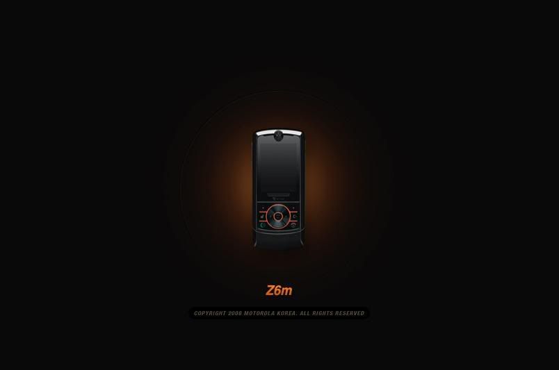
This is a cellphone official website for the Motorola Z6M. This site contains simple and clear information about the Motorola Z6M. The site is built with full flash, and enabled it to come out with nice effects and transitions. It has good contents arrangement with it manage to put all the contents and information about the phone clearly just in 4 navigations. In the term of colour and mood, it successfully brings out the identity of the products and in the same time, it blended well with the contrast and mood. Basicly the entire site is creatively designed.
http://musicaltalk.cafe24.com/main/index.php
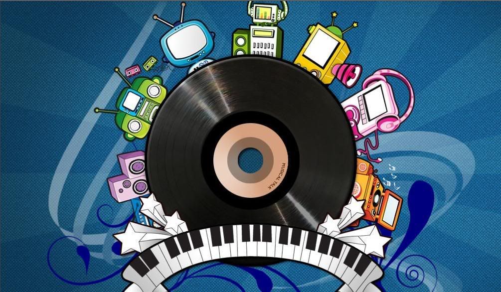
Interesting layout and nice graphic. Good hierachy of navigations and content design, easy to navigate.
http://www.30daysofnight.co.kr/
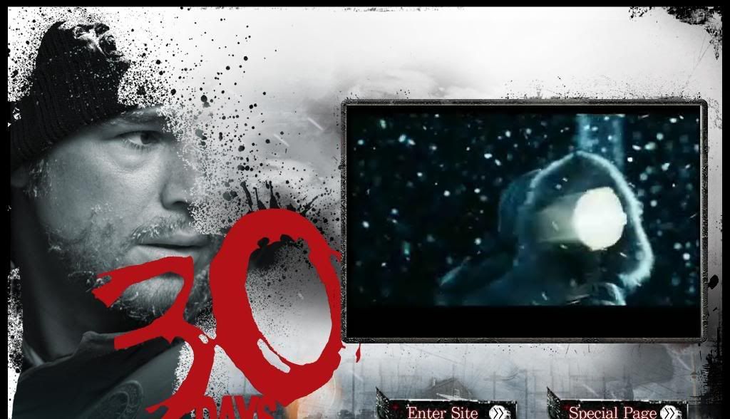
Basicly, the entire site is built with flash. It has nice transition and nice graphic. The contents are well arranged and the layout is consistently designed. However, I think a site which built with flash only, is not so flexible or convinient for changes and updating.
http://www.ivyclub.com/
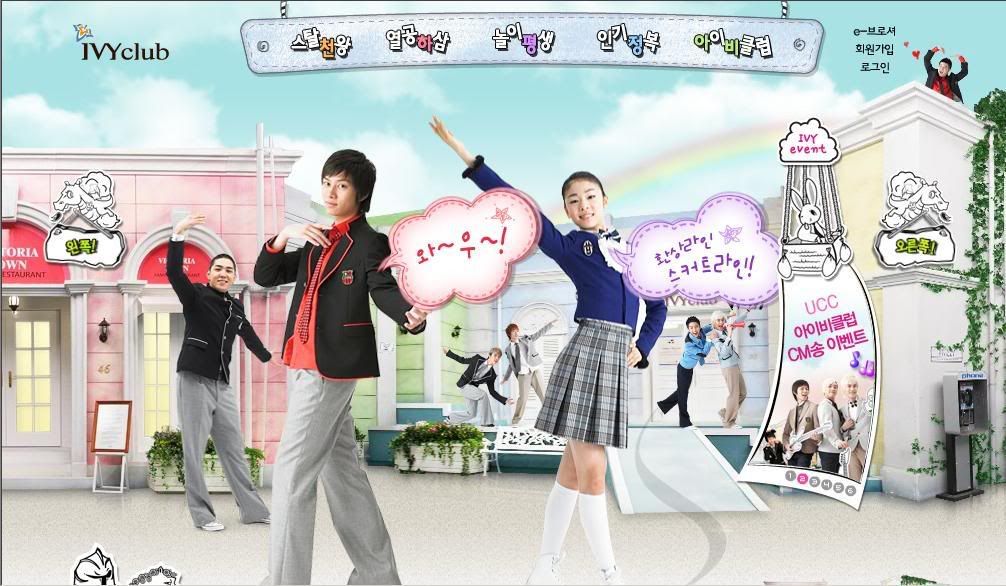
Basicly, this site has intersting graphic, navigations design and art direction. The website also has a lot of moving graphic that make it very motivated. However, in the same time, this nature also became its weakness. Because of everything is moving in the same time, it makes the website looks too busy and messy. It could be irritating for the user who prefer to be relax. The contents are too pack and also the navigations. The navigations are all over the top, left and right of the site and all of them has sub-navigations. They are too many and too messy.
http://tb.nexon.com/tb_cb/page/gnx.aspx?url=home/index
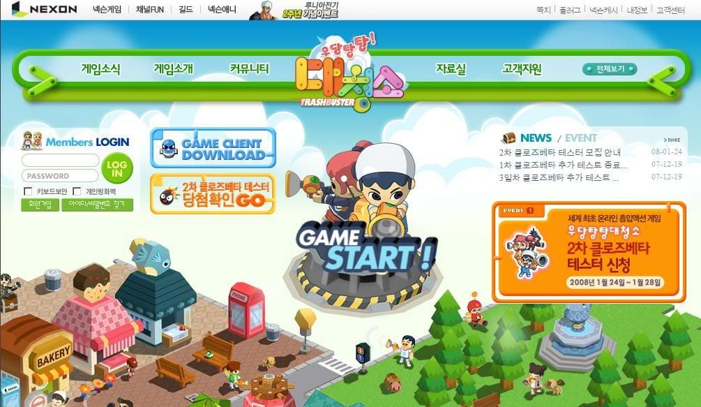
This is a official website for the online game "Trash Buster". The art direction follows the game image and the navigations and title typefaces are also specially designed. Basically the whole website is cute and interesting. In the same time it is easy to navigate with the well arranged contents design. The colour mood of the site make the site looks very refreshing and young. Suitable for an online game site which target audience on kids and teenagers.
No comments:
Post a Comment