- SONY
- PEPSI
- PILOT (TAIWAN)
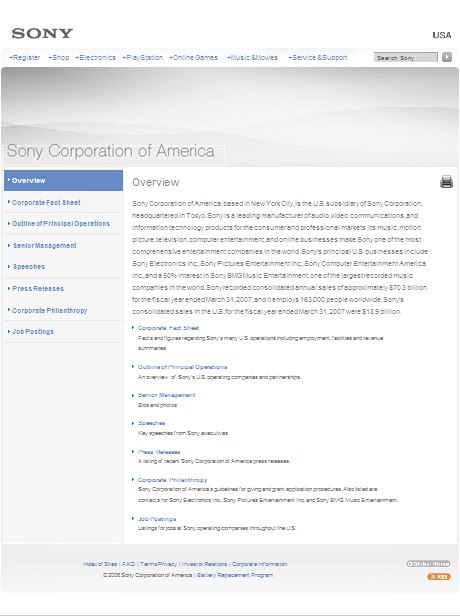
http://www.sony.com/SCA/index.shtml
Corporate website for Sony Corporation of America. It is vertical base and overall divided into 8 rows and 2 columns. The theme colors are white, blue and grey. White is used as background color, blue as title, and grey for text contents. The same style of fonts are consistently applied in this site which is san-serif. Different sizes and weights of fonts are also applied for different purposes of the text.
SCREENSHOOT
GRID
This site contents 3 main navigation bars. The brand logo is on top left and follow by the first main navigation bar below it. This navigation bar apply invert as the roll over effect, and sub-navigations appear in the drop down menu when hover. The second navigation bar is vertical and located on the middle left after the banner, and on the right is the main contents. In the navigation bar, selected navigation is highlighted with blue background and white text. Invert is also used as the roll over effect.The last navigation bar is very tiny and located at the bottom of the page. It don't catch too much attention and it only have simple effect which is underline when roll over.
Overall, I think this site is quite standard and simple. It is consistent in colors, fonts and style. It is full in contents while looks clean and easy to navigate. The only thing that I think not good enough is it is too clean and simple which make the site looks boring. In my opinion, maybe they should apply flash banner..
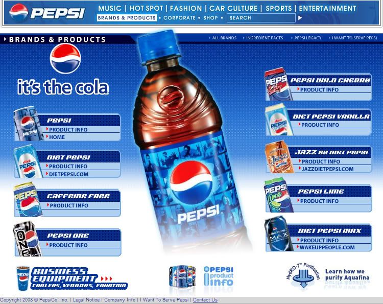
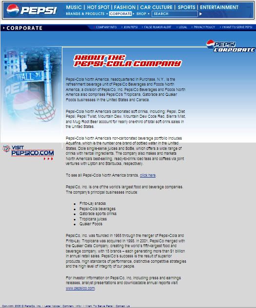
http://www.pepsi.com/pepsi_brands/index.php
The corporate website of Pepsi-Cola. The theme colors of the site are blue and white. Different scale of blue are used to different-shape different purpose of the text. The same style of fonts are applied, which is san-serif.
In gridding term, this site has different kind of grids depending on its contents. However, basicly the top and bottom gridings are the same, while the middle grids changes to fit in the contents.
SCREENSHOOT 1
GRID
This is the brand and products page of the site. Basicly, it is divided into 3 main rows and 1 column, with the top row contents a few tables, which included the logo and the main navigations. The middle part is blanked to fit in the flash and the bottom row is another navigation bar which divided to few columns.
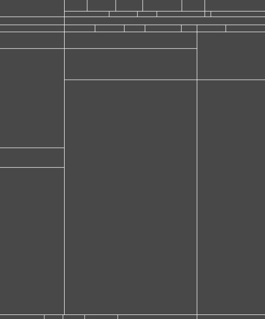
In another page, which is the corporate page, the gridding has a little different. The middle part is divided into 2 columns to fit in the images and the text contents. Other than that, all the grids are the same.
SCREENSHOOT 2
GRID
I like the theme and the mood of this website, and basicly everything is well organised and consistent. It also applied a lot of flash that make it looks more interesting. However, when I surf through the corporate page, I found that the background color of the main text contents in the middle suddenly change to grey. It looks like the texts are overflow the layout. I think it will looks better if the original gradient of the background in the layout continue.
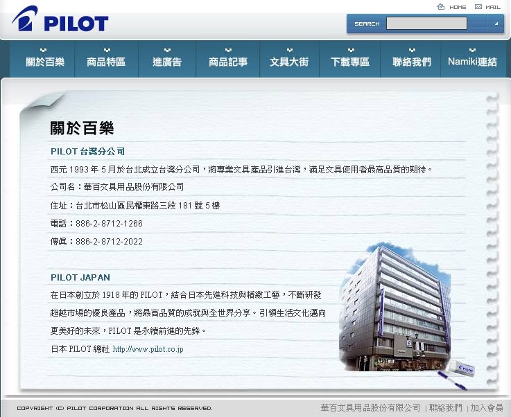
http://www.pilot-pen.com.tw/about.htm
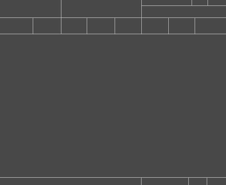
This is the homepage of Pilot Pen in Taiwan. This site have simple gridding, and the theme colors are white, blue and black. It is basicly divided into 4 rows 1 column, with the logo located at the first row, main navigations second, main content in flash in the middle and last the disclaimer.
SCREENSHOOT
GRID
This site is simple and interesting with the usage of flash elements. It is overall consistent and easy to navigate.
1 comment:
From your studies, I can see that you like Flash. I like Flash too and I use Flash oftenly for my projects.
One question... can you tell me why some websites, even some big corporate website did not use Flash?
Post a Comment