http://laphael.seaofmirrors.com/littlemakeupcorner/index.html
-This site teaches how to do oshare kei make up steps by steps.
http://www.diynetwork.com
-This site has many DIY tutorial for different catogary.
Monday, November 5, 2007
Monday, September 17, 2007
5 good websites
- H.Naoto
http://www.s-inc.com/hnaoto/heaven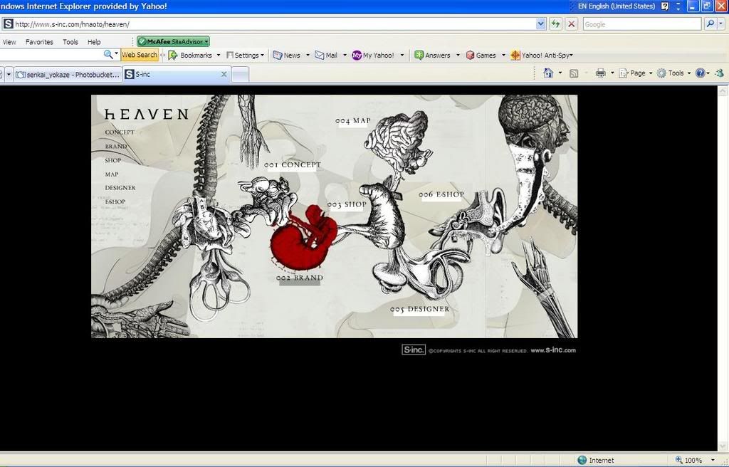
+Interesting navigations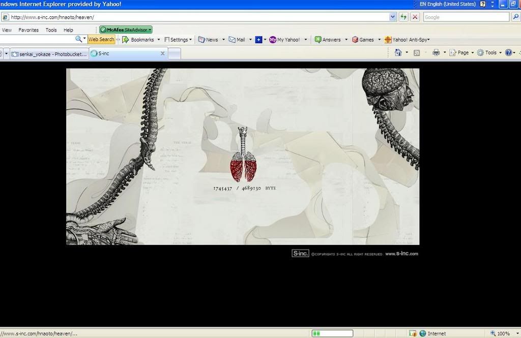
+Interesting and creative loading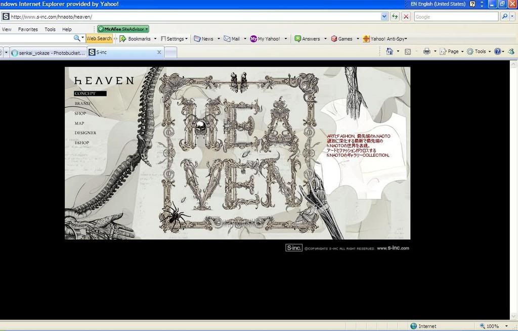
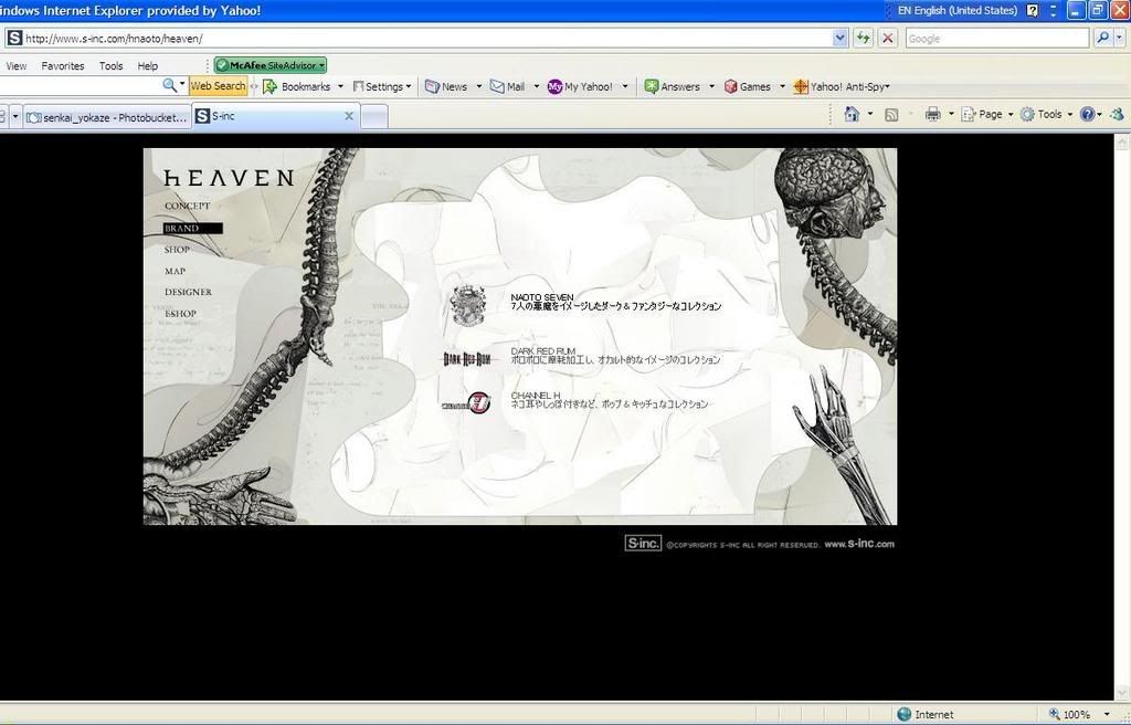
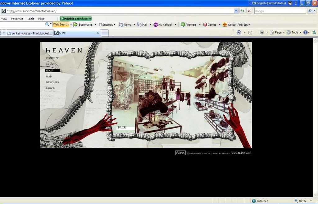
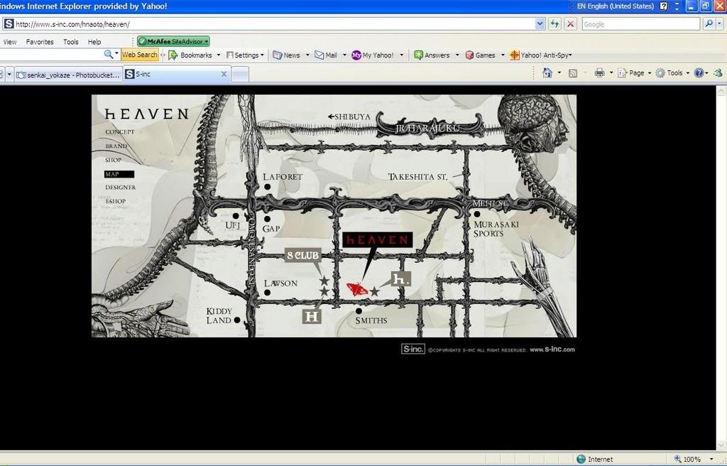
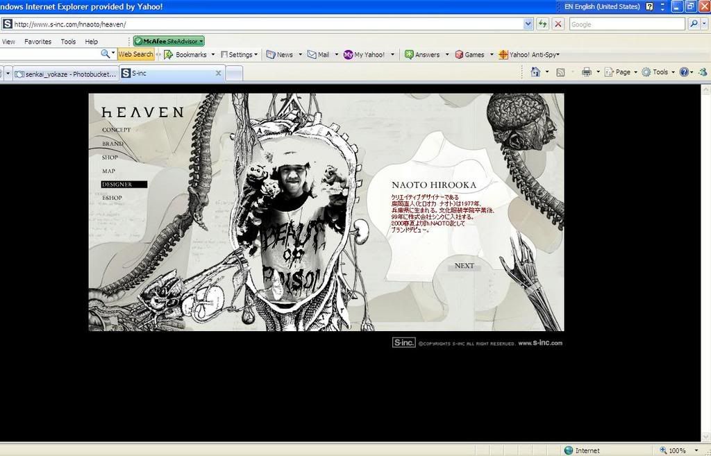
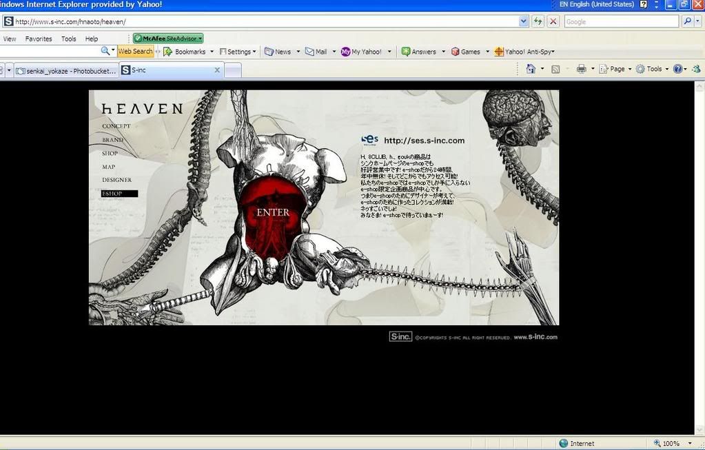
Conclusion:
H.Naoto is a high-class fashion brand in Japan which majors in gothic, punk and outranges fashion designs. It is very famous amongs teens in Japan especially in Harajuku. This website has a creative concept where the designer uses the human body organs as the main theme and navigation, which I think it matches with the image of the brand. I like especially the loading page, although maybe it looks a little creepy to some others, but I think it is interesting rather than juz a loading bar. It has consistent griding for the layout, contents, fonts, colors and navigations. The main colors of this site is black and white and red for highlights. It might looks complex caused by the anatomy graphics and ornaments, but actually it has a simple grid system and easy to navigate. However, it takes sometime to load. - Hotlink
http://www.hotlink.com.my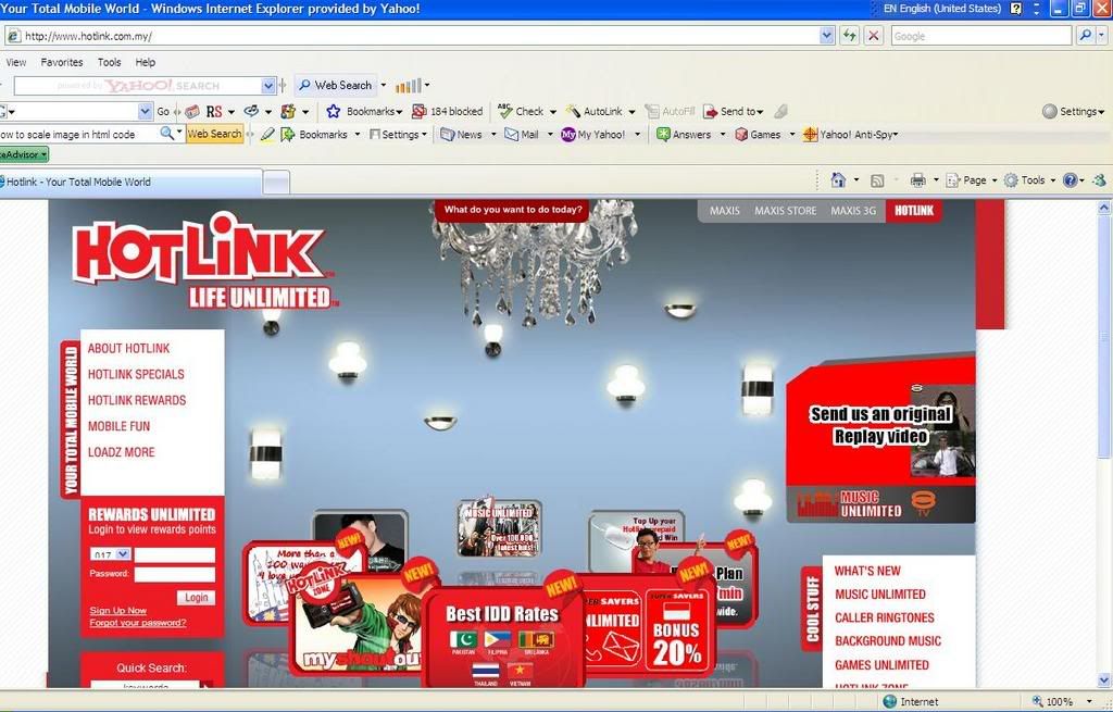
+Interesting interface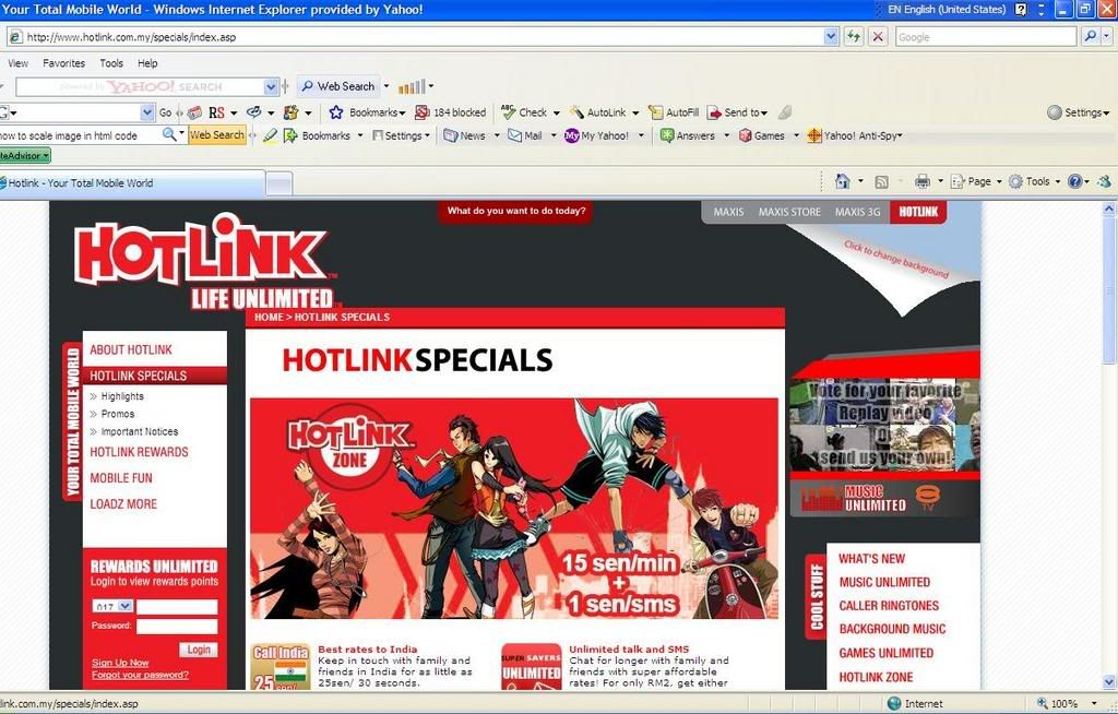
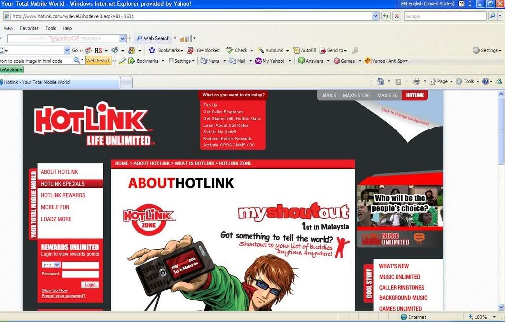
Conclusion:
This is the official website of Hotlink. The mainpage interface is interesting, where the main promotion of the month is highlighted in the wheel in the middle. This theme color of the website is red and white, which is the brand color of hotlink. This website has 3 navigation bars and all of them are in a consistent grid layout. It has very full and complete contents and info in the sub-navigations. It also has consistent fonts and its easy to navigate. However, the contents are too complete and caused the website and the navigations looks a little messy. - Nike's Official Online Store
http://www.nike.com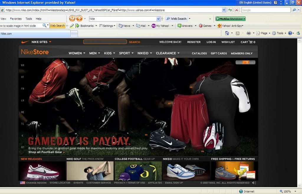
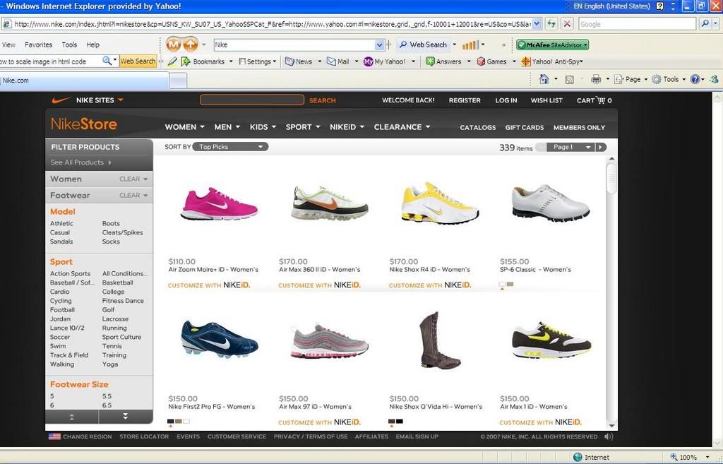
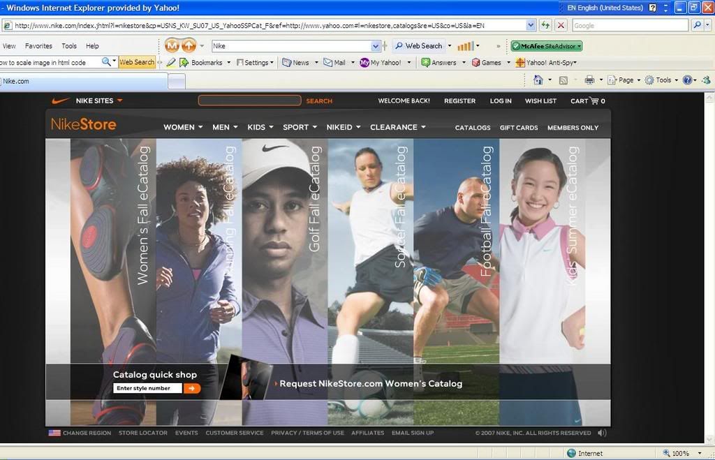
Conclusion:
This is the website for Nike Official Online Store. It has consistent griding for the layout and navigations. It has nice product overviews for every catogaries. It is easy to navigate and will leads to another sub-navigations once a navigation is clicked. It has very detail contents and info. It is good in a way where user can have a clearer about the products but it also caused inconvinient because it is too clumsy and messy to go through so many steps to get into the details. - PSP
http://www.us.playstation.com/psp_interactive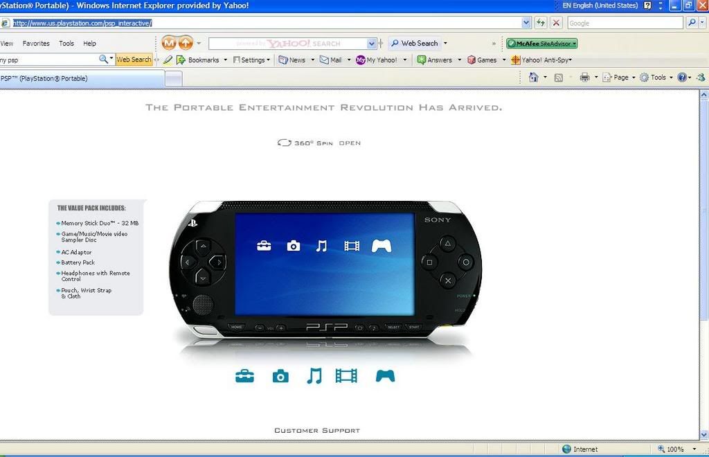
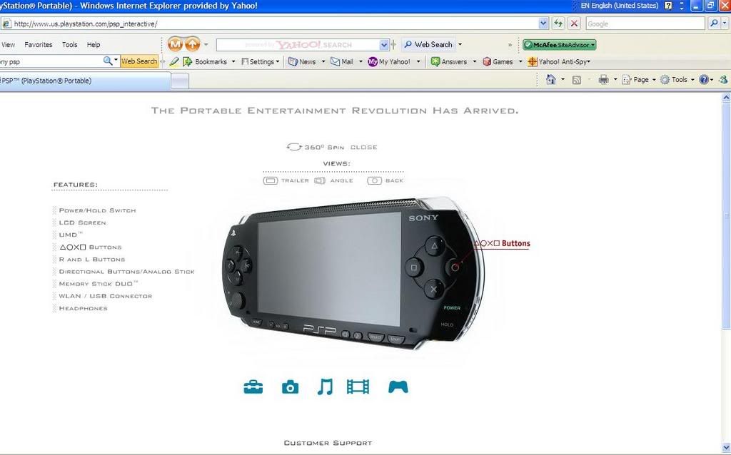
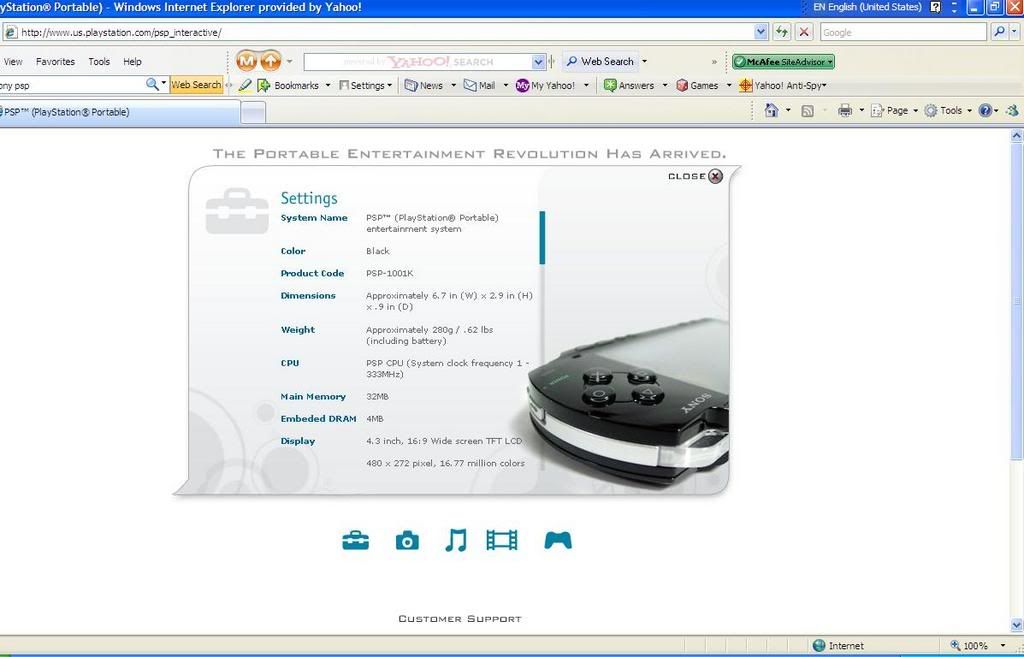
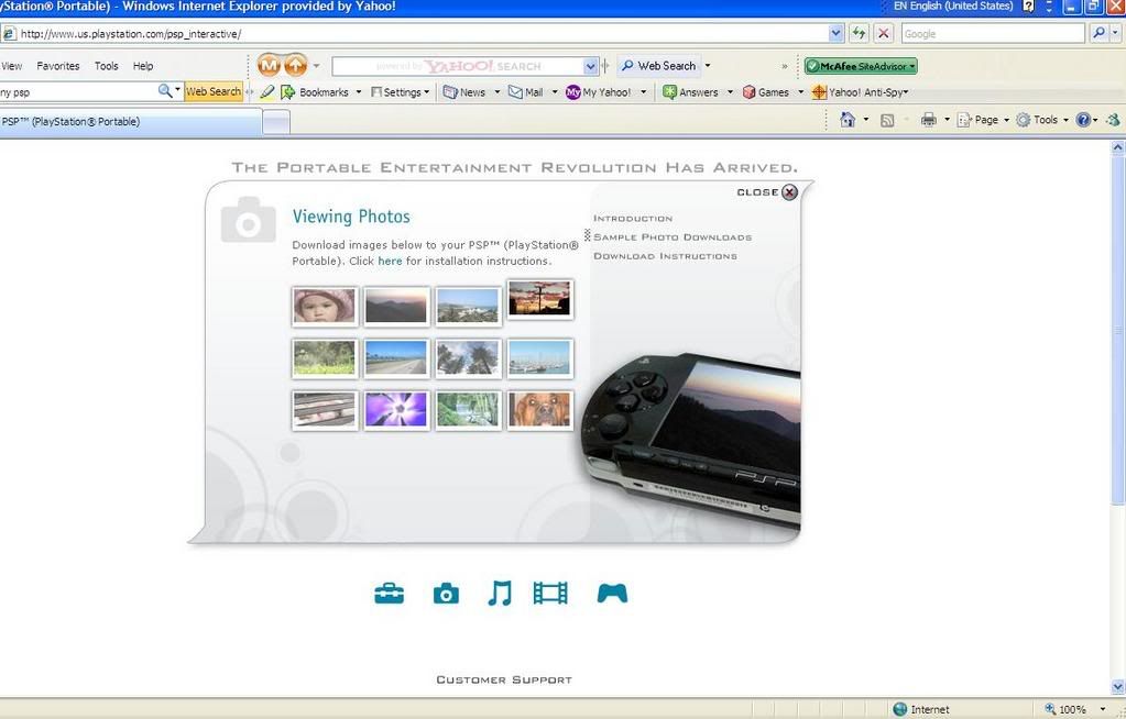
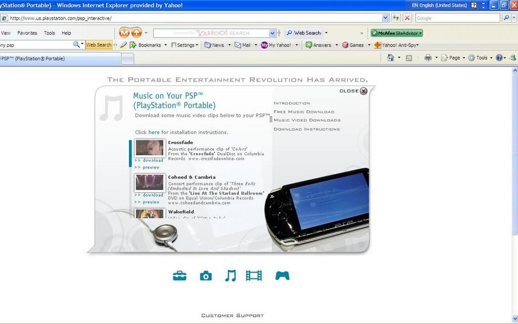
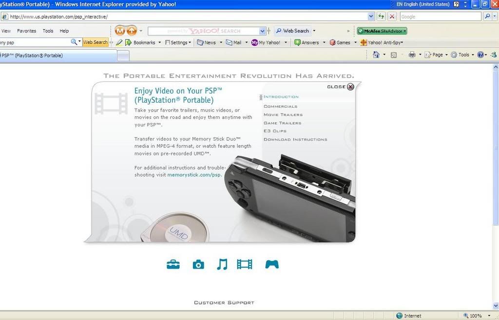
Conclusion:
This is the Official website of PSP US. It has a simple and clean layout which makes a lot of convinient for all ranges of users. It has a user friendly interface which can clearly explain the features info of the PSP, such as 360 angle spin open and interactive interface. The grid system of the website is consistent where every contents and navigation is placed neatly and easy to navigate. It also has consistent fonts and color. The theme color of the site is grey black and light blue, with white background. Although clean and simple is easier to navigate, but as a high-tech products, I think the theme layout colour is a little too dull and a little too simple. - FURI FURI COMPANY
http://www.furifuri.com/2005/furifuri2005.html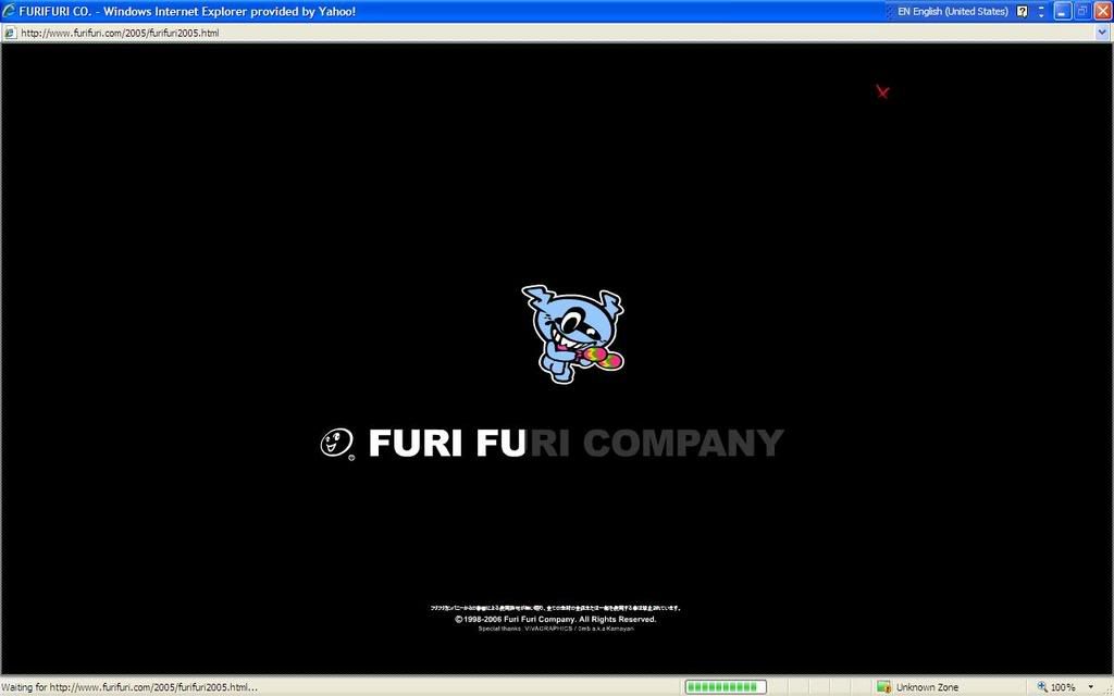
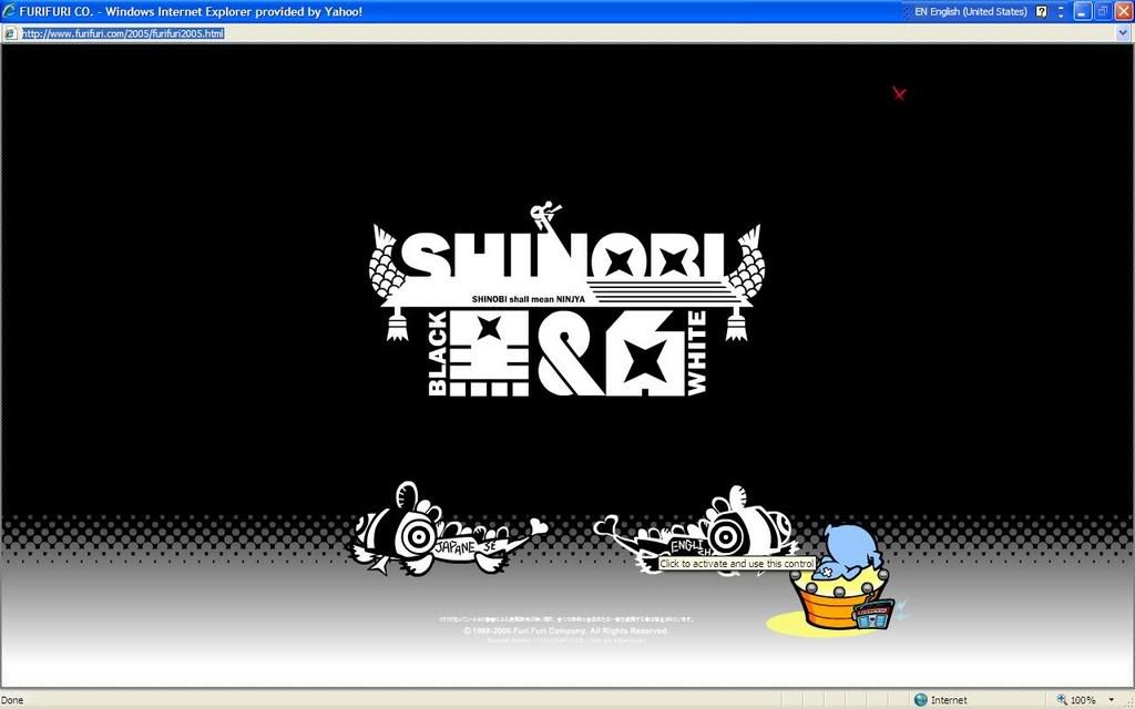
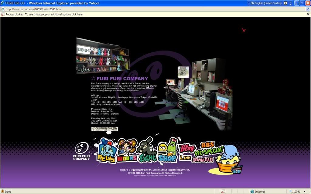
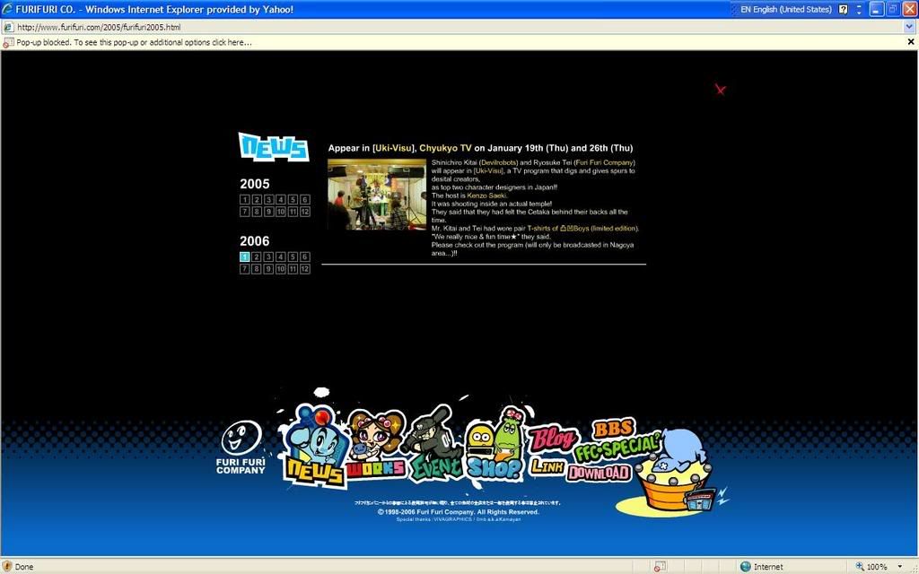
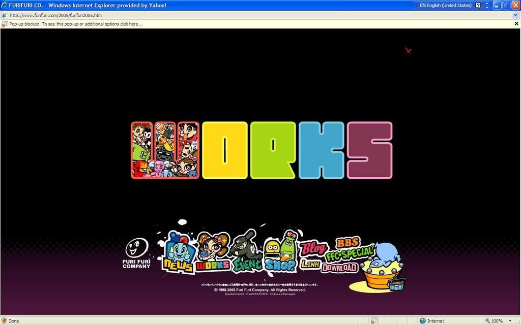
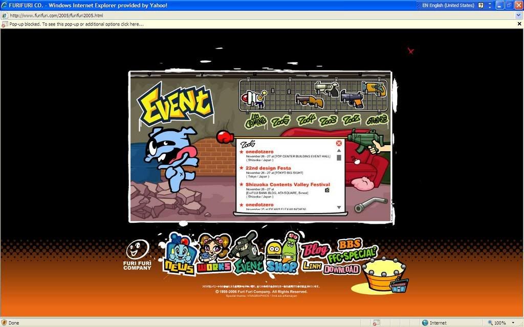
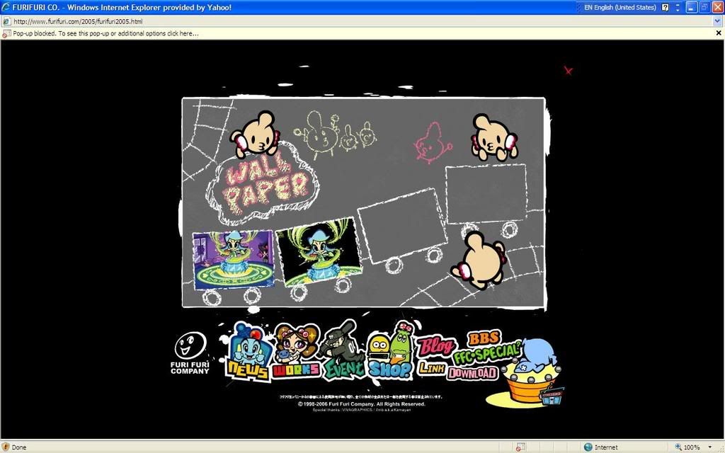
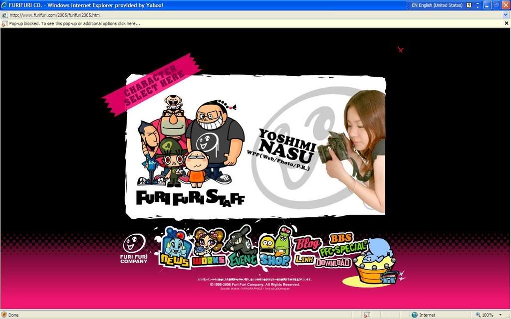
Conclusion:
This is the official website for Furi Furi Company. Basicly, of all the websites here, I think this is the most interesting and best of all. It has very interesting and creative interface and also very attractive graphics and colour. Other than that it also contents background music and interesting sound effect. It has very creative buttons where every of them is different and has different sound effect when hover. The entire site is interactive and easy to navigate. The contents and info are quite complete and all of them are well arranged under a consistent navigations and layout. The best part is although it contents a lot of effects and info, it is not that heavy and the loading time is quite fast. But unfortunately, the outcome is not so consistent in different browser.
Subscribe to:
Posts (Atom)